Advanced Tips for Using the Tool: Pro Techniques
Published on: October 2, 2025
Designing with professional tools is not just about knowing where the buttons are. It’s about using advanced techniques that transform ordinary work into eye-catching, polished visuals. Whether you’re creating social media ads, product showcases, or branded graphics, applying pro-level methods can make your designs stand out. Below, we’ll explore in detail some powerful tips and tricks that will help you unlock the full potential of your design tool.
1. Combine Reflection and Shadow for Realism
One of the most effective ways to give your products a professional look is by blending reflection with subtle shadows. This technique simulates real-life lighting and makes objects appear more natural, almost as if they are placed in a studio environment. For e-commerce product shots, this can be the difference between an amateur look and a premium feel.
Pro Tip: Keep reflections light and shadows soft—too much can make the image look artificial.
2. Use 3D Text Rotation for Dynamic Titles
Flat text often struggles to grab attention in competitive ad spaces. By adding a 3D rotation effect, you can create titles and taglines that feel dynamic and engaging. This is especially effective for Facebook ads or promotional banners, where every second of user attention counts.
Pro Tip: Pair 3D titles with high-contrast backgrounds to maximize readability.
3. Adjust Contrast for Stronger Backgrounds
Backgrounds play a huge role in the impact of a design. By adjusting contrast levels, you can highlight key elements and make your composition pop. A high-contrast background draws attention to the main subject without overwhelming the viewer.
Pro Tip: Always preview your designs on different screens. What looks balanced on a laptop might appear too dark on a smartphone.
4. Design with Mobile-First in Mind
The majority of users consume content on their phones, so your design must be optimized for mobile platforms. Test presets such as the TikTok vertical orientation or Instagram Reels format to ensure that your design fits perfectly on mobile screens.
Pro Tip: Keep essential elements like logos and call-to-action text within the “safe zone” to prevent cropping on small devices.
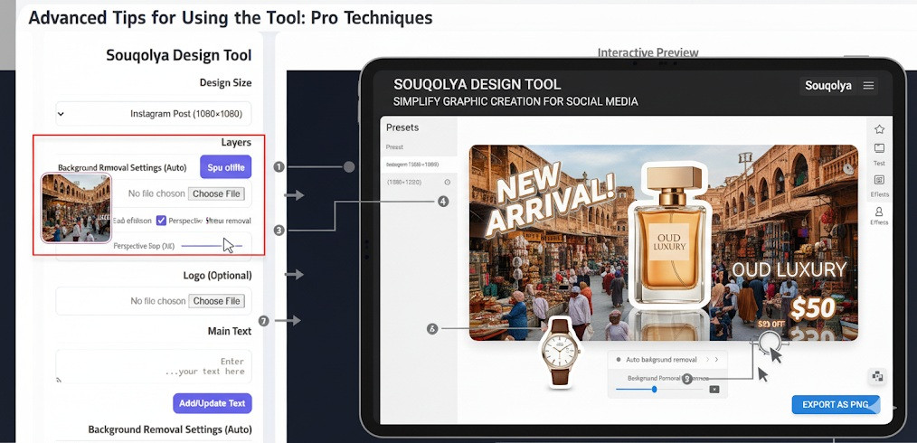
5. Integrate Logos at 20% Scale
Branding should be visible, but not overwhelming. A logo scaled to around 20% of the design’s width is usually enough to reinforce your identity without stealing attention from the main content. This balance is key when creating professional ads.
Pro Tip: Position the logo consistently across designs to build recognition.

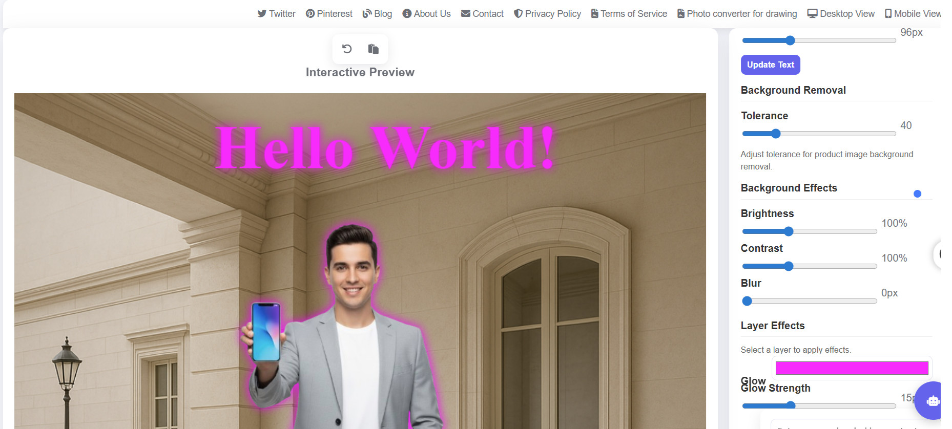
6. Experiment with Glow Effects
Glow can add depth and energy to your visuals when applied carefully. Try matching glow colors with your existing brand palette for a cohesive, modern aesthetic. This is especially powerful for highlighting call-to-action buttons, key text, or product features.
Pro Tip: Subtle glows work best—avoid neon-like overexposure unless it’s part of your creative style.
7. Save Iterations for Team Reviews
Creative work rarely happens in one perfect draft. Saving multiple versions of your design allows you and your team to review, compare, and choose the strongest option. This practice also helps prevent loss of progress if you need to revisit an earlier stage.
Pro Tip: Label saved files with clear names like “Ad_Version_A” or “Homepage_Banner_Concept2” for easier collaboration.
8. Avoid Common Mistakes Like Over-Blurring
Many beginners fall into the trap of overusing the blur effect. While blur can soften edges or backgrounds, too much makes the image look unprofessional. A good rule is to keep blur tolerance under 100 to maintain clean, sharp visuals.
Pro Tip: Instead of blurring heavily, try combining light blur with contrast adjustments for a smoother look.
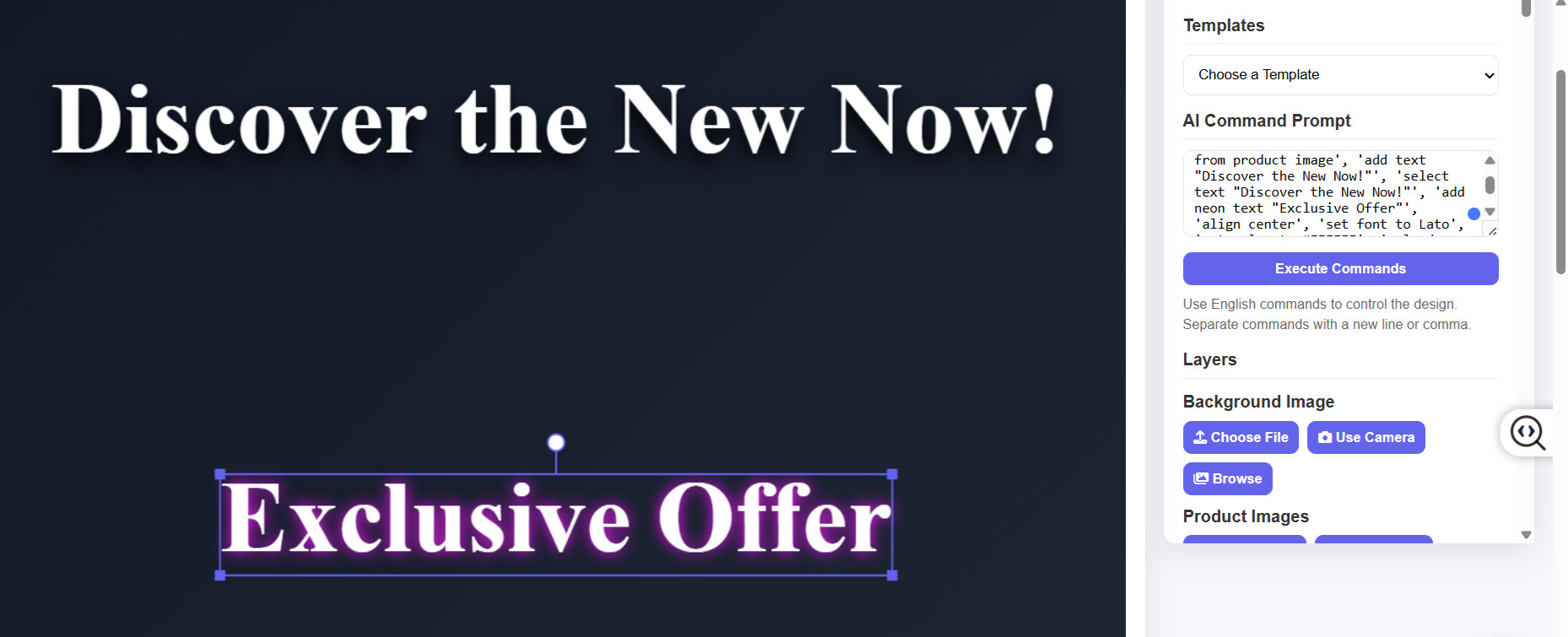
9. Explore Layer Effects for More Creativity
Your design tool likely includes advanced layer effects such as bevel, emboss, overlay, or gradient styles. Mastering these features can elevate your work dramatically. For example, layering multiple shadows can create a sense of depth, while gradient overlays add a modern and stylish finish.
Pro Tip: Check out a dedicated Layer Effects Tutorial to discover new combinations and creative workflows.
Final Thoughts
Professional-looking design doesn’t come from using fancy tools alone—it comes from knowing how to apply techniques strategically. By combining reflection with shadow, experimenting with text rotation, optimizing for mobile, and mastering layer effects, you can take your designs to the next level.
The key is balance: keep your branding clear, your visuals polished, and your creativity flowing. With these pro tips, you’ll not only improve the quality of your designs but also enhance engagement and results across all platforms.
1. Combine Reflection and Shadow for Realism
One of the most effective ways to give your products a professional look is by blending reflection with subtle shadows. This technique simulates real-life lighting and makes objects appear more natural, almost as if they are placed in a studio environment. For e-commerce product shots, this can be the difference between an amateur look and a premium feel.
Pro Tip: Keep reflections light and shadows soft—too much can make the image look artificial.
2. Use 3D Text Rotation for Dynamic Titles
Flat text often struggles to grab attention in competitive ad spaces. By adding a 3D rotation effect, you can create titles and taglines that feel dynamic and engaging. This is especially effective for Facebook ads or promotional banners, where every second of user attention counts.
Pro Tip: Pair 3D titles with high-contrast backgrounds to maximize readability.
3. Adjust Contrast for Stronger Backgrounds
Backgrounds play a huge role in the impact of a design. By adjusting contrast levels, you can highlight key elements and make your composition pop. A high-contrast background draws attention to the main subject without overwhelming the viewer.
Pro Tip: Always preview your designs on different screens. What looks balanced on a laptop might appear too dark on a smartphone.
4. Design with Mobile-First in Mind
The majority of users consume content on their phones, so your design must be optimized for mobile platforms. Test presets such as the TikTok vertical orientation or Instagram Reels format to ensure that your design fits perfectly on mobile screens.
Pro Tip: Keep essential elements like logos and call-to-action text within the “safe zone” to prevent cropping on small devices.
5. Integrate Logos at 20% Scale
Branding should be visible, but not overwhelming. A logo scaled to around 20% of the design’s width is usually enough to reinforce your identity without stealing attention from the main content. This balance is key when creating professional ads.
Pro Tip: Position the logo consistently across designs to build recognition.
6. Experiment with Glow Effects
Glow can add depth and energy to your visuals when applied carefully. Try matching glow colors with your existing brand palette for a cohesive, modern aesthetic. This is especially powerful for highlighting call-to-action buttons, key text, or product features.
Pro Tip: Subtle glows work best—avoid neon-like overexposure unless it’s part of your creative style.
7. Save Iterations for Team Reviews
Creative work rarely happens in one perfect draft. Saving multiple versions of your design allows you and your team to review, compare, and choose the strongest option. This practice also helps prevent loss of progress if you need to revisit an earlier stage.
Pro Tip: Label saved files with clear names like “Ad_Version_A” or “Homepage_Banner_Concept2” for easier collaboration.
8. Avoid Common Mistakes Like Over-Blurring
Many beginners fall into the trap of overusing the blur effect. While blur can soften edges or backgrounds, too much makes the image look unprofessional. A good rule is to keep blur tolerance under 100 to maintain clean, sharp visuals.
Pro Tip: Instead of blurring heavily, try combining light blur with contrast adjustments for a smoother look.
9. Explore Layer Effects for More Creativity
Your design tool likely includes advanced layer effects such as bevel, emboss, overlay, or gradient styles. Mastering these features can elevate your work dramatically. For example, layering multiple shadows can create a sense of depth, while gradient overlays add a modern and stylish finish.
Pro Tip: Check out a dedicated Layer Effects Tutorial to discover new combinations and creative workflows.
Final Thoughts
Professional-looking design doesn’t come from using fancy tools alone—it comes from knowing how to apply techniques strategically. By combining reflection with shadow, experimenting with text rotation, optimizing for mobile, and mastering layer effects, you can take your designs to the next level.
The key is balance: keep your branding clear, your visuals polished, and your creativity flowing. With these pro tips, you’ll not only improve the quality of your designs but also enhance engagement and results across all platforms.
My Personal Experience with Souqolya Design Tool
Say your opinion about the tool
Comments
No comments yet. Be the first to comment!